Colour Psychology: Styling Inspiration for your Home
- Flying Dutch Mum
- Jun 30, 2020
- 5 min read
Updated: Jan 25, 2021
Well hello there! It's been a while...

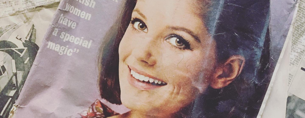
...the move to Devon and the house renovation have been ALL consuming (we FINALLY exchanged end of January! Hurray!). Until now, it has mainly been demolishing with dust and grime everywhere (and I mean everywhere! Even in places I didn't think were possible... don't go there!) And the surprises! Renovating rarely goes to plan, but never thought a tree would p(r)op up in the ceiling?! Magazines and newspapers, yes, and even a coin or two for good luck, but a tree-trunk?! Nope!
Anyhow, we can't wait until the rebuilding is on its way and we can start seeing some progress. However, that may be some time away because these unprecedented times have slowed the renovation project down significantly. It's not at a complete halt, but let's say it's a snails pace (guess that is better than a sloth - ha! ha!) The upside being that we can take stock, re-evaluate a few things and turn our thoughts to interior decorating.
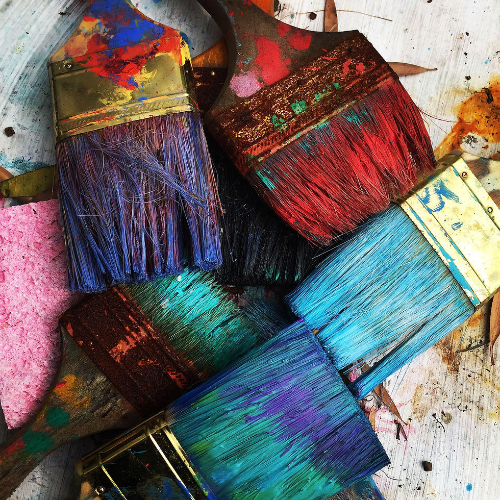
That brings me to COLOUR. How do you choose the right colour? How do you create a cohesive colour scheme? How do you mix colour and pattern? The FlyingHubby wants everything light and airy and, as such, chooses white by default and automatically discounts any form of colour - sigh! So how do we find a happy medium? Obviously, the latter is a question that many of you would like to find a simple, straightforward answer to, but which, unfortunately, at this time eludes also me...
Back to colour. In the words of Paul Gauguin:
"Colour! What a deep and mysterious language, the language of dreams!"
Mysterious it definitely is.
THE SCIENCE BEHIND COLOUR
We have only uncovered the surface in terms of what colour actually does to and for us. Did you know... there is the belief that the human eye can see more than 10 million colours? That according to YouGov blue is the world's favourite colour; followed closely by green, red and purple. Annnd, here's a good one,... Men and women see colour differently. Take red as an example: according to scientists the gene that helps us see red sits on an X-chromosome and guess what, women have two of them! And (here's a whopper) according to a study in PubMed women have a larger colour vocabulary. Guess those last two facts explains why the FlyingHubby and I don't see eye to eye on colour.
The topic of colour psychology is fascinating! People's reaction to colour depends on culture, context, upbringing and personal preference. In China red symbolises luck, in Western society it symbolises love or danger. Until the 1940’s pink was actually for boys, after which it was changed by US clothing manufacturers as part of a marketing scheme. As for me, I'm not too fond of deep green and dark grey as it reminds me of my school uniform. This particular combination was drab and dreary!
But there is a science behind colour, notably a real break through with The Wright Theory. This has led to a better understanding of the effect, albeit sub-consciously, that colour can have on mood and behaviour. Other experts have also shown scientifically that people do react to colour. Take pink as an example: a study in the late 60’s showed that colour effects the muscle tone. Subjects staring at a particular colour pink (Baker-Miller pink) lowered the heart rate, pulse and respiration. Because of this soothing, calming effect, pink could, therefor, suit in bedrooms.
Whereas red has been proven to speed up reactions, overstimulate and reduce the ability to think analytically. However, on a more positive note red does help to focus on detailed tasks & increases memory retrieval by 31% in comparison to blue. Although we possibly wouldn't want red in the bedroom as it energises (well, unless...of course you know...), we could use it in the living room where we may want to stimulate conversation or in a home gym. So every colour has both positive and negative attributes.
All very interesting facts you say , but how on earth do you translate this into practical tips for your interiors?! Well, let's for now focus on the very first question - how to choose the right colour? With possibly the emphasis on the word "right". After all, according to the GoodHome Report carried out by the Happiness Research Institute in Copenhagen, happiness in the home is only second to our mental health in terms of our sense of well being. We spend so much time at home, and obviously even more so now, that getting it right becomes even more important. Especially since colour has such an impact on mood and behaviour.
PRACTICAL TIPS FOR CHOOSING COLOUR
We often look towards trends to guide us and determine what to choose (read my blog on 2020 interior design trends here if you want to more know). With today's new reality of working from home, home schooling and social distancing people are looking for ways and things that help our mental well-being whether it be in the clothes we wear or the home accessories that we surround ourselves with. According to WGSN since the lock-down there seems to be a trend towards the use of soft, pastel colours to sooth the soul but equally a trend for strong, invigorating colours to help energise us.
Pantone suggests 3 groups of colour trends for summer and spring 2021 - summer bouquet, intoxicating and power surge.

All again driven by the current climate that we seek inspiration from nature and also want to feel empowered in a certain way during these disruptive times.
What is the function of the room?
Firstly, when considering colour for your interiors consider the function of each room and the feeling you want to create. For example: the bedroom is a place to relax and sleep. According to a scientific study the colour blue facilitates sleep. And although certain blue colours can come across as cool and distant, adding warmer hues and/or a touch of soft pink could create a relaxing atmosphere and nurture sleep.
Have you got a favourite home accessory or furniture item?
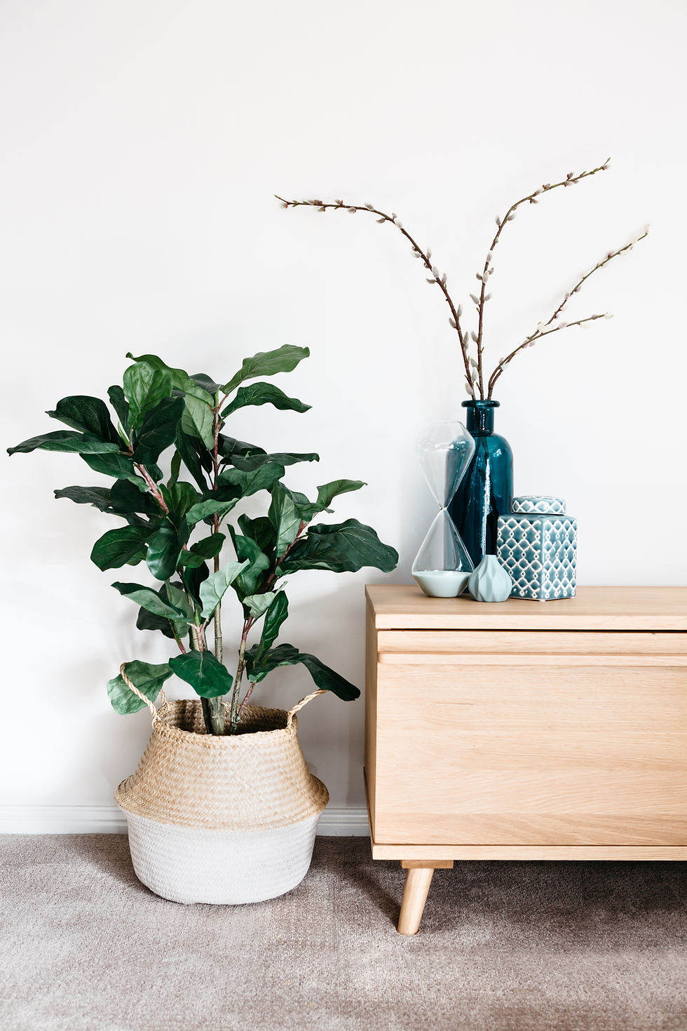
Secondly, use your existing wall art, accessories or upholstered furniture to pick your wallcolours. Is there a favourite colourful decorative vase or a Persian rug you brought back from your travels?
Choose a colour from it and build your colour scheme from there.
Is there a theme in your wardrobe?
And lastly, they say fashion and interiors are intrinsically connected; what's on the catwalk eventually ends up in the home. So look to your wardrobe.

When choosing colour most of us really do know what we like, but we haven’t quite worked out what it is. So open your wardrobe doors and drawers and stand back. Soon you will see a theme emerging. In the words of Kate Watson-Smyth,
"If you are comfortable wearing it, you will be comfortable living in it. It's that simple."
Although, in my case that might mean worn, faded jeans and stained greyish white t-shirts.... hmm Stiffkey Blue (Farrow & Ball) and Drifting Snow (Sherwin Williams)
photo credits: @Rhondak on unsplash; @toa_heftiba on unsplash; @dtvrensburg on unsplash


Comments